Segmented control
/seg-MEN-ted con-TROLE/ · noun · NAV pattern · #048
A row of equal buttons where exactly one wins at a time. Best for 2–5 flat views of the same thing — never for actions.
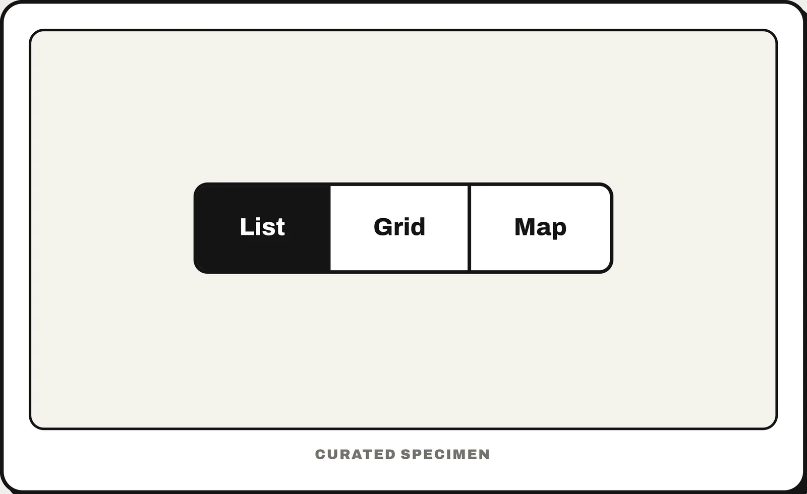
Also called: segmented button, segment control.
You might call it
- “the toggle between two or three options”
- “the buttons that switch between list and grid view”
- “pill buttons where only one is selected”
- “a row of connected buttons”
- “tab-like toggle buttons”
…its name is Segmented control.
Common questions
Segmented control vs tabs: what is the difference?
Tabs change which content you see — each tab owns its own panel or section. A segmented control changes how the same content is shown or filtered, like List / Grid / Map over one set of results. If switching would replace the whole page with unrelated content, you want tabs (or a tab bar), not a segmented control.
What is a segmented control called in Material Design?
Segmented buttons. Material 3 uses that name for the same pattern: two to five joined options, single- or multi-select. Apple’s Human Interface Guidelines call it a segmented control.
In code
| SwiftUI | Picker .pickerStyle(.segmented) |
|---|---|
| UIKit | UISegmentedControl |
| Jetpack Compose | SingleChoiceSegmentedButtonRow SegmentedButton |
| Android (Views) | MaterialButtonToggleGroup |
| Flutter | SegmentedButton CupertinoSlidingSegmentedControl |
| Web (HTML / ARIA) | role="radiogroup" No native element — a radio group, or buttons with aria-pressed |
Prompt for your AI coding tool
Add a segmented control above the content with two to five options shown as one connected row of equal-width segments. Exactly one segment is selected and visibly filled; choosing another changes how the same content is shown or filtered, without leaving the page. Make it a single-choice group for keyboard and screen-reader users (radio-group semantics).
More UI words to use when vibe coding →