UI words to use when vibe coding
AI coding tools build what you name. “Add a popup” could mean five different components; “add a popover anchored to the share button” means one. Here is the vocabulary — what people usually call each element, the name to tell your AI, and a ready prompt behind every link.
How to describe a UI element to an AI coding tool
- Use the conventional name. “Tabs”, not “the clickable headings”; “toast”, not “a little message”.
- Say where it sits and what it holds. Above the content, anchored to a button, pinned to the bottom edge; three labels, an icon and a line of text.
- List its states. Selected, disabled, loading, empty and error — the states you do not mention are the ones that come back missing.
- Ask for the platform component and accessibility. Name the role or component and how it should work with a keyboard and screen reader.
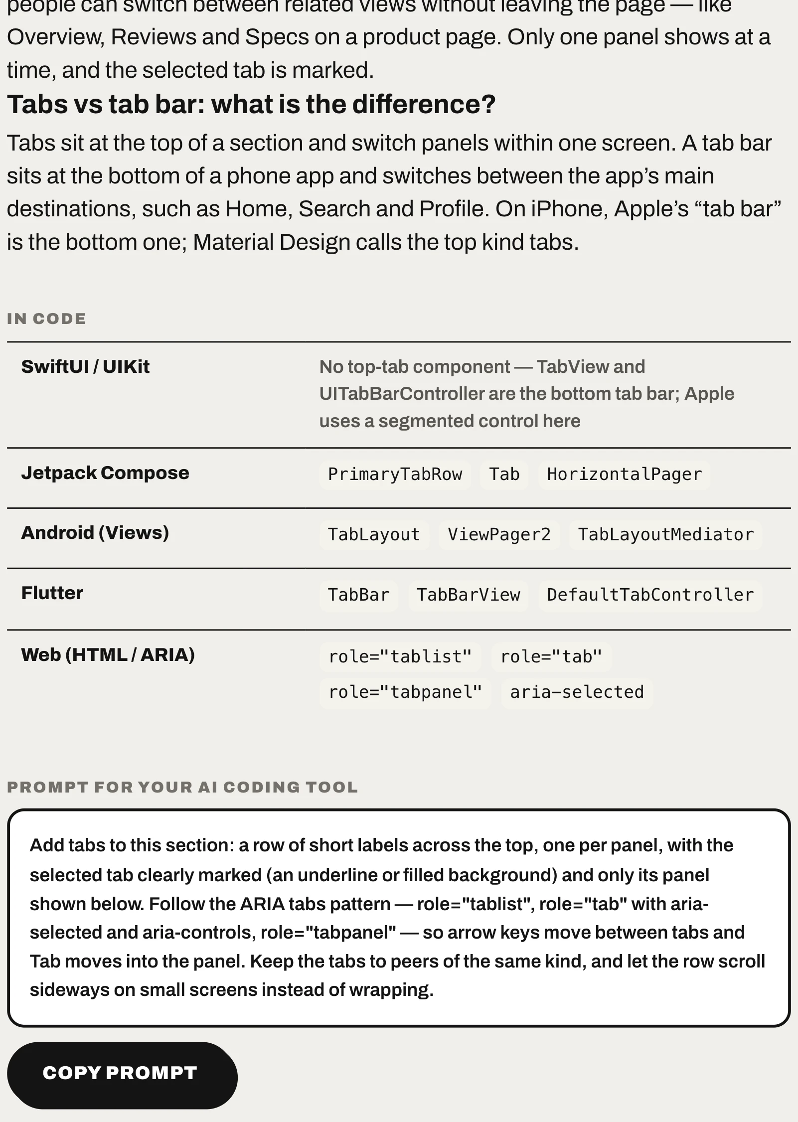
Put together, a prompt for tabs reads:
Add tabs to this section: a row of short labels across the top, one per panel, with the selected tab clearly marked (an underline or filled background) and only its panel shown below. Follow the ARIA tabs pattern — role="tablist", role="tab" with aria-selected and aria-controls, role="tabpanel" — so arrow keys move between tabs and Tab moves into the panel. Keep the tabs to peers of the same kind, and let the row scroll sideways on small screens instead of wrapping.
Words that get mixed up
These everyday words each cover several different patterns. Pick the one you mean:
| If you say… | You might mean |
|---|---|
| “a popup” | Modal dialog — blocks the page until answered Popover — anchored to a button, page stays usable Toast — brief message that leaves on its own Bottom sheet — slides up from the bottom edge Alert banner — stays across the top until dismissed |
| “a dropdown” | Dropdown menu — picks one value from a list Overflow menu — three dots holding extra actions Accordion — expands a section in place |
| “a toggle” | Toggle switch — on/off switch for one setting Segmented control — picks one of 2–5 views Checkbox — one of several independent choices |
| “the menu icon” | Hamburger menu — three lines: hidden navigation Overflow menu — three dots: hidden actions |
| “tabs” | Tabs — switch panels within one section Tab bar — switch the app’s main destinations Segmented control — switch how the same content is shown |
| “a loader” | Loading spinner — short, unknown wait Progress bar — measurable work Skeleton screen — content is loading into a known layout |
Navigation
Moving between places in the app.
| If you would say… | Tell your AI |
|---|---|
| “the toggle between two or three options” | Segmented controlrole="radiogroup" |
| “the icons at the bottom of an app” | Tab bar<nav> |
| “the Home › Category › Page links at the top” | Breadcrumb<nav aria-label="Breadcrumb"> |
| “the page numbers at the bottom” | Pagination<nav aria-label="Pagination"> |
| “the three lines menu icon” | Hamburger menu<button aria-expanded> |
| “the tabs at the top of a page” | Tabsrole="tablist" |
Input
Typing, choosing and adjusting values.
| If you would say… | Tell your AI |
|---|---|
| “an on/off switch” | Toggle switch<input type="checkbox" role="switch"> |
| “the search bar” | Search field<search> |
| “the plus and minus buttons” | Stepper<input type="number"> |
| “a tick box” | Checkbox<input type="checkbox"> |
| “the round buttons where you pick one” | Radio group<input type="radio" name="…"> |
| “the volume bar you drag” | Slider<input type="range"> |
| “a calendar picker” | Date picker<input type="date"> |
| “filter pills above a list” | Filter chips<button aria-pressed> |
| “the box you click to pick from a list” | Dropdown menu<select> |
| “the box you type in” | Text field<input type="text"> |
Actions
Buttons and gestures that do something.
| If you would say… | Tell your AI |
|---|---|
| “the round plus button in the bottom-right corner” | Floating action button |
| “Save and Cancel buttons side by side” | Button grouprole="group" |
| “the three dots menu” | Overflow menu<button aria-haspopup="menu"> |
| “swipe down to refresh” | Pull to refreshoverscroll-behavior-y |
Overlays
Panels that open on top of the page.
| If you would say… | Tell your AI |
|---|---|
| “the menu that slides up from the bottom” | Bottom sheet<dialog> |
| “a pop-up window that blocks the page” | Modal dialog<dialog> |
| “the iPhone menu that pops up from the bottom with Cancel” | Action sheet |
| “the text that appears when you hover” | Tooltiprole="tooltip" |
| “the little box that pops up when you click” | Popoverpopover |
Feedback
Telling people what happened or what is happening.
| If you would say… | Tell your AI |
|---|---|
| “a pop-up message that disappears on its own” | Toastrole="status" |
| “a loading bar” | Progress bar<progress> |
| “grey loading boxes” | Skeleton screenaria-busy="true" |
| “the no results page” | Empty state |
| “the red dot notification” | Badge |
| “the loading circle” | Loading spinnerrole="status" |
| “the bar across the top of a website” | Alert bannerrole="status" |
Content
Ways to lay out items and information.
| If you would say… | Tell your AI |
|---|---|
| “a box with an image, a title and a short text” | Card<article> |
| “an image slider” | Carouselscroll-snap-type |
| “expand / collapse sections” | Accordion<details> |
Data
Rows and columns of records.
| If you would say… | Tell your AI |
|---|---|
| “a sortable table” | Data table<table> |
Phone and computer system UI
The parts of iOS, Android, macOS and Windows around your app — what to say when your layout has to work with them.
| If you would say… | Tell your AI |
|---|---|
| “the black bar at the top of iPhone” | Dynamic Islandenv(safe-area-inset-top) |
| “the bar at the top of the phone screen” | Status bar<meta name="theme-color"> |
| “the line at the bottom of iPhone” | Home indicatorenv(safe-area-inset-bottom) |
| “the notch on iPhone” | Notchviewport-fit=cover |
| “the swipe down menu on iPhone” | Control Center |
| “the swipe down notifications on iPhone” | Notification CenterNotification |
| “the circle button on iPhone screen” | AssistiveTouch |
| “the swipe down menu on Android” | Quick Settings panel |
| “the 3 buttons at the bottom of Android” | Android navigation bar |
| “the sidebar on Samsung” | Edge panel |
| “the bar at the top of a Mac” | Mac menu bar |
| “the thing at the bottom of a Mac” | Dock |
| “the bar at the bottom of Windows” | Taskbar |
| “the icons at the bottom right of Windows” | System tray |
Common questions
What should I say instead of “popup” when prompting AI?
Name the kind of popup. A modal dialog blocks the page until answered; a popover opens beside a button and leaves the page usable; a toast says one thing and disappears; a bottom sheet slides up from the bottom edge; an alert banner stays across the top until dismissed. Each one is built differently, so the name decides what you get.
How do I describe a UI to Cursor, Claude Code or another AI coding tool?
Use the conventional name of each element, then say where it sits, what it contains, which states it has (selected, disabled, loading, empty, error) and what accessibility it needs. Every entry in the CatchUI catalog ends with a prompt written that way that you can paste and adjust.
Do AI coding tools understand UI pattern names?
The conventional names — segmented control, bottom sheet, toast, data table — are the same ones used throughout component libraries and platform documentation, so they map to specific components. Everyday descriptions like “the little bar” leave the tool to guess which component you mean.
What if I do not know what the element is called?
Take a screenshot of an app or site that has it and upload it to CatchUI: it boxes each element and gives its conventional name. You can also connect the CatchUI MCP server so your AI assistant can look names up from a plain-language description.