Floating action button
/FLOH-ting AK-shun BUT-un/ · noun · ACTION pattern · #057
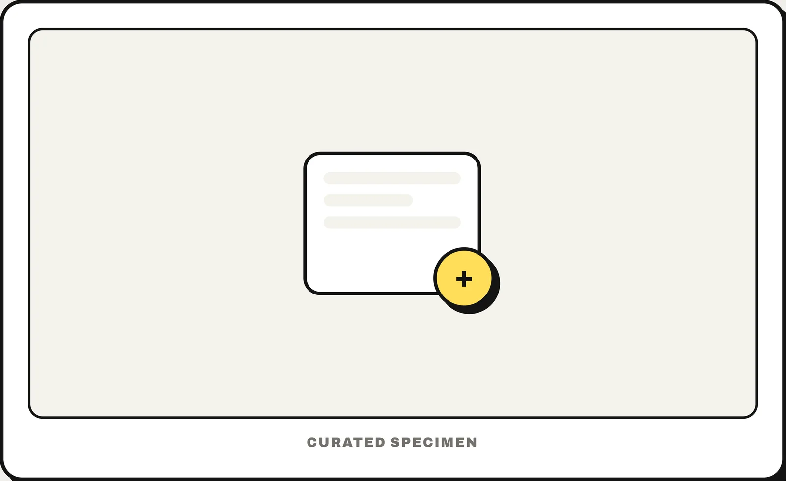
One round button floating above everything, reserved for the screen's single most important action. Two FABs means zero priorities.
Also called: FAB, floating button.
You might call it
- “the round plus button in the bottom-right corner”
- “a floating button”
- “the circle button that floats over the content”
- “the Compose button in Gmail”
- “the add button in the corner”
…its name is Floating action button.
Common questions
What is the round floating button in the corner of an app called?
A floating action button (FAB), a Material Design pattern — a circular button hovering above the content, reserved for the screen’s single most important action.
In code
| iOS (SwiftUI / UIKit) | No FAB — Apple puts the primary action in the navigation bar or toolbar |
|---|---|
| Jetpack Compose | FloatingActionButton ExtendedFloatingActionButton |
| Android (Views) | FloatingActionButton ExtendedFloatingActionButton |
| Flutter | FloatingActionButton Scaffold(floatingActionButton:) |
| Web (HTML) | No native element — a <button> with position: fixed |
Prompt for your AI coding tool
Add a floating action button for the screen’s single most important action: a round button with an icon in the bottom-right corner, floating above the content and staying put while it scrolls. Give it an accessible label naming the action (for example “New message”), keep it clear of the bottom navigation and safe area, and do not add more than one. Optionally show the label next to the icon (an extended FAB) when there is room.
More UI words to use when vibe coding →