Button group
/BUT-un GROOP/ · noun · ACTION pattern · #058
Related actions lined up shoulder to shoulder, sharing borders and importance. When one matters most, it gets the filled style — the rest stay quiet.
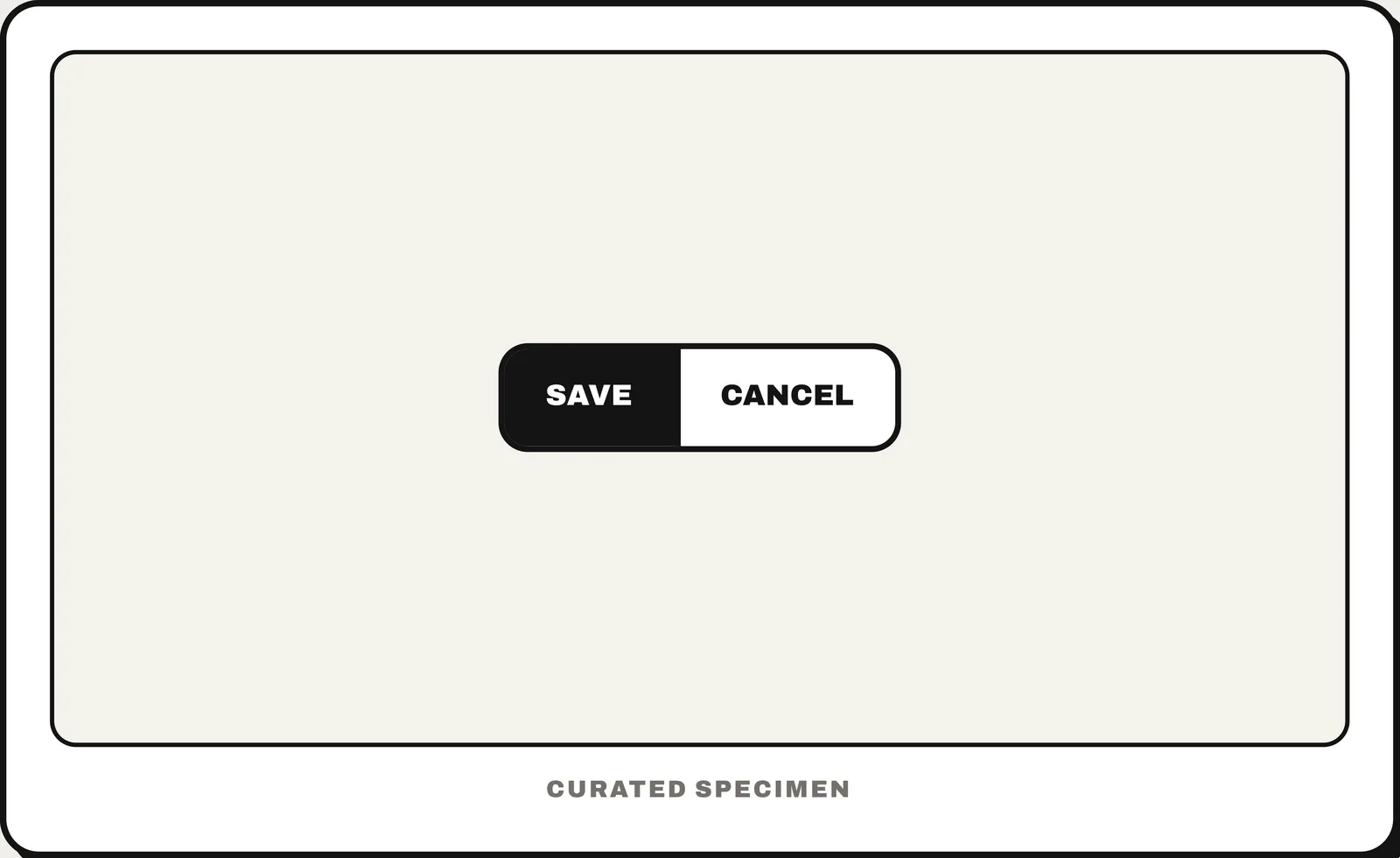
You might call it
- “Save and Cancel buttons side by side”
- “the primary and secondary buttons”
- “two buttons next to each other”
- “the OK / Cancel button pair”
- “the button bar at the bottom of a form”
…its name is Button group.
Common questions
Which goes first, OK or Cancel?
Follow the platform. Windows puts OK before Cancel; macOS, iOS and Android put Cancel first and the confirming action last, on the right. On the web, pick one order for the whole product and make the primary button visually stronger.
In code
| SwiftUI | ControlGroup HStack |
|---|---|
| UIKit / Android | No dedicated component — a stack or row of a filled and an outlined button |
| Flutter | OverflowBar |
| Web (HTML / ARIA) | role="group" |
Prompt for your AI coding tool
Add a button group at the end of the form: the primary action as a filled button labelled with its verb (for example “Save changes”) and the secondary action (“Cancel”) as an outlined or text button beside it. Keep the order consistent across the app, give them equal height, stack them full-width on narrow screens with the primary on top, and never style two actions in the group as primary.
More UI words to use when vibe coding →