Filter chips
/FIL-ter CHIPS/ · noun · INPUT pattern · #056
Small rounded tokens that toggle facets of a list on and off. The active set doubles as a summary of what you're looking at.
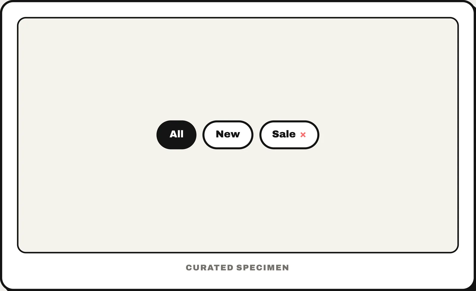
Also called: filter chip, filter tags, faceted filter chips.
You might call it
- “filter pills above a list”
- “the little filter buttons you tap on and off”
- “filter tags under the search bar”
- “rounded toggle buttons for filtering results”
- “the selected filters shown as pills”
…its name is Filter chips.
Common questions
What are filter chips in UI design?
Filter chips are compact controls that turn facets of a list on and off. Selected chips show the active filters directly above or beside the results.
When should UX use filter chips instead of checkboxes?
Use filter chips for a small, visible set of frequently changed filters. Use checkboxes when the option list is longer, needs grouping, or belongs inside a dedicated filter panel.
In code
| SwiftUI / UIKit | No system chip — usually a Toggle with a custom button style, or capsule-shaped buttons |
|---|---|
| Jetpack Compose | FilterChip |
| Android (Views) | Chip ChipGroup Widget.Material3.Chip.Filter |
| Flutter | FilterChip ChoiceChip |
| Web (HTML / ARIA) | <button aria-pressed> No native chip — toggle buttons with aria-pressed, or styled checkboxes |
Prompt for your AI coding tool
Add filter chips above the results: a single row of compact, rounded chips, one per filter value. Tapping a chip toggles it on or off; selected chips are visibly filled and show a check mark, and several can be on at once. Filtering updates the results immediately, the row scrolls horizontally if it overflows, and each chip is a toggle button for screen readers (aria-pressed on the web).
More UI words to use when vibe coding →