Skeleton screen
/SKEL-uh-tun SKREEN/ · noun · FEEDBACK pattern · #064
Grey ghost shapes standing in for content while it loads, promising the layout before the data arrives. Feels faster than a spinner because it shows where things will land.
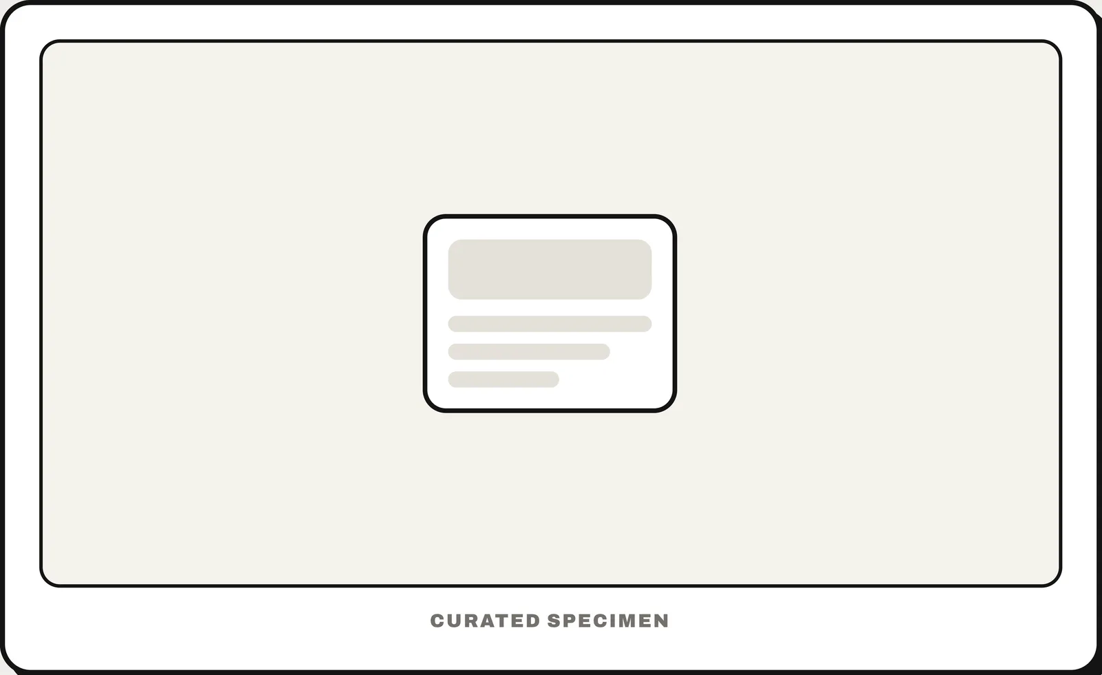
Also called: skeleton loader, ghost elements, content placeholder.
You might call it
- “grey loading boxes”
- “a loading placeholder”
- “the grey shapes before content loads”
- “shimmer loading”
- “the blank outline of the page while it loads”
…its name is Skeleton screen.
Common questions
What are the grey placeholder shapes shown while content loads called?
A skeleton screen (or skeleton loader): grey ghost shapes that hold the layout while data arrives. It feels faster than a spinner because it promises where things will land.
Skeleton screen vs spinner: which is better?
Use a skeleton screen when you know the layout that is loading, such as a feed or a list of cards: it feels faster and avoids layout jumps. Use a spinner for short waits or actions with no predictable layout.
In code
| SwiftUI | .redacted(reason: .placeholder) |
|---|---|
| UIKit / Android / Flutter | No built-in skeleton — grey placeholder views shaped like the content, often with a shimmer |
| Web (HTML / ARIA) | aria-busy="true" |
Prompt for your AI coding tool
Add a skeleton screen while this list loads: grey placeholder blocks in the same shapes and positions as the real content (avatar circle, two text lines of different widths, image box), with a subtle shimmer that is turned off for reduced motion. Swap in the real content in place without the layout jumping, mark the region aria-busy="true" while loading, and fall back to an error message if loading fails.
More UI words to use when vibe coding →