Card
/KARD/ · noun · CONTENT pattern · #067
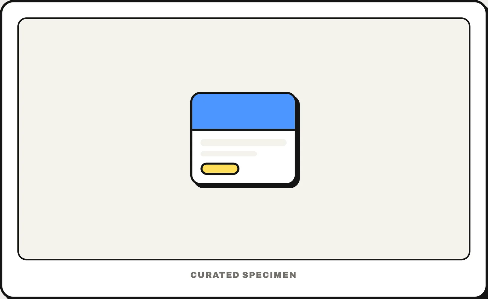
A bounded container that makes one item — image, title, meta, action — feel like a single graspable thing. The workhorse of every feed and grid.
You might call it
- “a box with an image, a title and a short text”
- “product tiles”
- “the rounded boxes in a grid”
- “a content block you can tap”
- “card UI”
…its name is Card.
Common questions
What is a card in UI design?
A rectangular container that groups an image, a title, a short text and actions about one item, such as a product or an article. Cards usually sit in a grid or a feed, and the whole card is often tappable.
In code
| SwiftUI / UIKit | No card component — a rounded container (GroupBox, or a styled view) |
|---|---|
| Jetpack Compose | Card ElevatedCard OutlinedCard |
| Android (Views) | MaterialCardView |
| Flutter | Card |
| Web (HTML) | <article> |
Prompt for your AI coding tool
Show these items as cards in a responsive grid: each card is a rounded container with an image at the top, a title, one or two lines of description and at most one or two actions. The whole card is one link to the item’s page — the title is the link, stretched to cover the card — so there are no nested links. Keep card heights consistent in a row and use <article> elements on the web.
More UI words to use when vibe coding →