Accordion
/uh-KOR-dee-un/ · noun · CONTENT pattern · #069
Stacked headers that expand one section at a time, keeping long content scannable. The chevron is the promise; the collapse is the mercy.
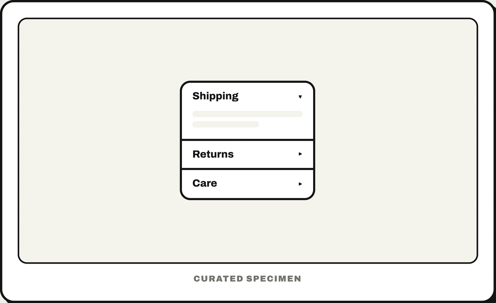
Also called: collapsible sections, expand / collapse.
You might call it
- “expand / collapse sections”
- “the FAQ where you click a question to see the answer”
- “a dropdown section”
- “the plus sign that opens more text”
- “collapsible panels”
…its name is Accordion.
Common questions
What is an accordion in web design?
A stack of headers that each expand to reveal their content and collapse to hide it, as on many FAQ pages. In HTML it can be built with <details> and <summary>.
In code
| SwiftUI | DisclosureGroup |
|---|---|
| UIKit | UICellAccessory.outlineDisclosure |
| Jetpack Compose / Android | No accordion component — a clickable header row that shows content with AnimatedVisibility |
| Flutter | ExpansionTile ExpansionPanelList |
| Web (HTML / ARIA) | <details> <summary> aria-expanded |
Prompt for your AI coding tool
Turn these questions into an accordion: each question is a full-width header row with a chevron that rotates when open; clicking or pressing Enter/Space shows the answer below it. Allow several to be open at once unless there is a reason not to, start them collapsed, and keep the answers in the page so they can be found with Ctrl+F and by search engines (<details> and <summary> on the web).
More UI words to use when vibe coding →