Carousel
/kar-uh-SEL/ · noun · CONTENT pattern · #068
A horizontal strip of items you swipe through, with a peek of the next one as the invitation. Position dots keep you honest about how deep it goes.
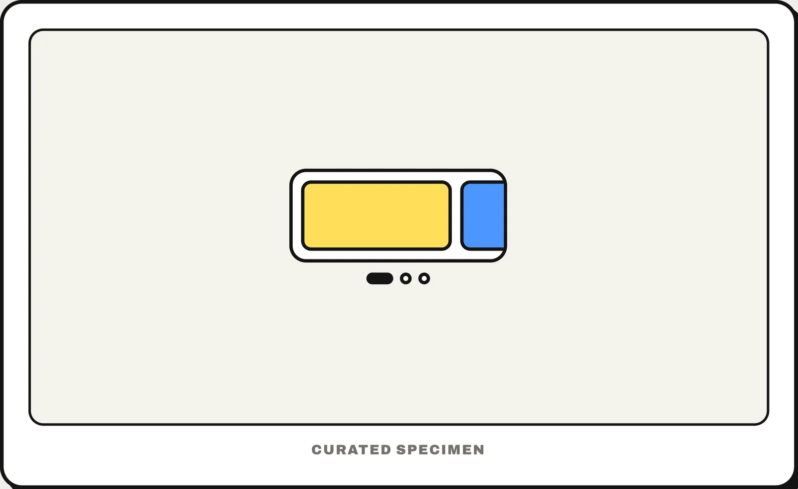
Also called: image slider, slideshow.
You might call it
- “an image slider”
- “a slideshow on a website”
- “a sliding or rotating banner”
- “cards you swipe through sideways”
- “the photos with little dots underneath”
…its name is Carousel.
Common questions
Carousel vs slider: what is the difference?
In everyday speech they are the same: a carousel, also called an image slider or slideshow, shows one slide at a time that you swipe or click through. In UI vocabulary a slider can also mean the control you drag to set a value.
What is a carousel on a website?
A rotating banner or row of slides with arrows and dots to move between items. Most visitors only see the first slide, so put the most important item first and avoid auto-advance.
In code
| SwiftUI | TabView .tabViewStyle(.page) |
|---|---|
| UIKit | UIPageViewController UIPageControl |
| Jetpack Compose | HorizontalPager HorizontalMultiBrowseCarousel |
| Android (Views) | ViewPager2 CarouselLayoutManager |
| Flutter | PageView CarouselView |
| Web (HTML / ARIA) | scroll-snap-type aria-roledescription="carousel" No native element — a scroll-snapping row |
Prompt for your AI coding tool
Add a carousel: a horizontal row of slides the user can swipe or scroll, snapping to each slide, with the edge of the next slide visible as a hint. Show position dots under it and previous/next buttons on larger screens. Do not auto-advance — or if it must, pause on hover, on focus and with a visible pause button — and keep every slide reachable by keyboard and announced as “slide 2 of 5”.
More UI words to use when vibe coding →