Popover
/POP-oh-ver/ · noun · OVERLAY pattern · #078
A small panel that opens beside the thing you clicked, pointing back at it, and holds real content — options, a short form, a preview. Unlike a tooltip it waits for a click and can be used; unlike a modal it leaves the page alone.
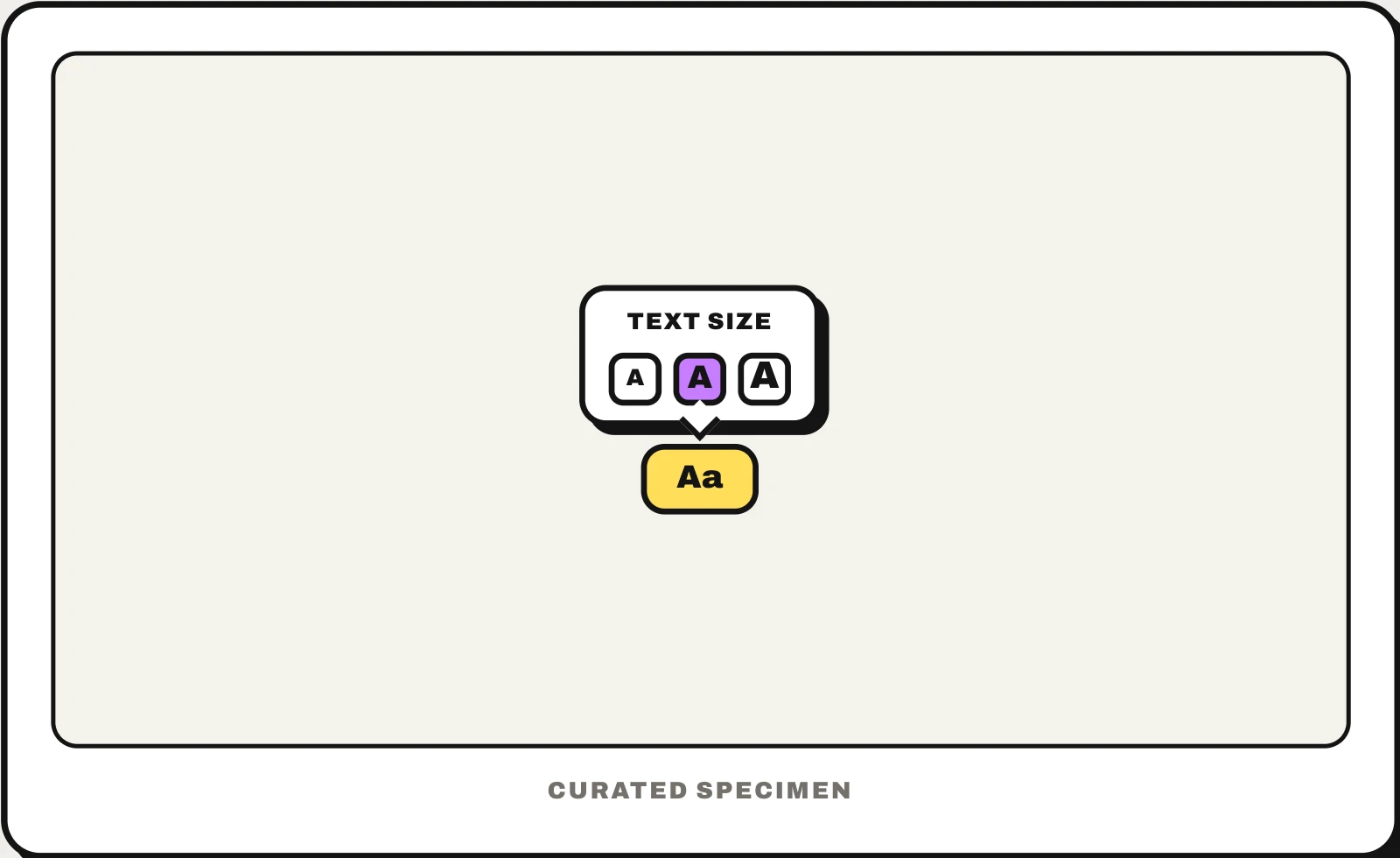
Also called: popover menu, popup panel, flyout.
You might call it
- “the little box that pops up when you click”
- “a speech-bubble popup with a pointer”
- “a popup next to a button”
- “the small panel that opens beside an icon”
- “a click popup with options in it”
…its name is Popover.
Common questions
Popover vs tooltip: what is the difference?
A tooltip appears on hover or focus, holds one short read-only line and disappears when you move away. A popover opens on click, stays open, and can hold buttons, links or a form you interact with. If the user needs to click something inside it, it has to be a popover.
Popover vs modal: what is the difference?
A modal dialog blocks the whole page until you answer it. A popover is anchored to the element that opened it and leaves the rest of the page usable — click outside and it simply closes. Use a modal for a decision that must be made now, and a popover for optional detail or quick settings.
In code
| SwiftUI | .popover(isPresented:) |
|---|---|
| UIKit | UIPopoverPresentationController .modalPresentationStyle = .popover |
| Jetpack Compose | Popup |
| Android (Views) | PopupWindow |
| Flutter | OverlayPortal No popover widget — built on an overlay |
| Web (HTML / ARIA) | popover popovertarget showPopover() |
Prompt for your AI coding tool
Add a popover to this button: clicking it opens a small panel anchored beside the button, with a pointer back to it, holding the extra controls. It stays open while the user works in it; clicking outside, pressing Escape or clicking the button again closes it and returns focus to the button. On the web use the popover attribute with popovertarget so light dismiss and top-layer stacking come built in; on phones, show the same content as a bottom sheet.
More UI words to use when vibe coding →