Tooltip
/TOOL-tip/ · noun · OVERLAY pattern · #061
A tiny label that appears on hover or focus to name or explain the thing under the pointer. If the interface needs it to be understood, the interface is hiding too much.
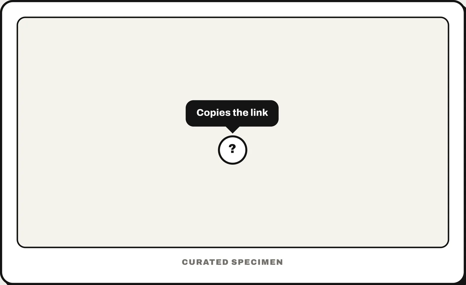
Also called: hover text, hover box.
You might call it
- “the text that appears when you hover”
- “hover text”
- “the little box that pops up over a button”
- “a hover box”
- “the hint when you hold the mouse over an icon”
…its name is Tooltip.
Common questions
What is hover text called?
A tooltip: a small label that appears when you hover over or focus an element, naming or explaining it. Do not put essential information in one, because touch screens have no hover.
Tooltip vs popover: what is the difference?
A tooltip is a short, non-interactive hint shown on hover or focus. A popover opens on click or tap and can hold richer content and controls, such as links or buttons.
In code
| SwiftUI | .help() TipView |
|---|---|
| UIKit | UIToolTipInteraction |
| Jetpack Compose | TooltipBox PlainTooltip |
| Android (Views) | TooltipCompat.setTooltipText() |
| Flutter | Tooltip |
| Web (HTML / ARIA) | role="tooltip" aria-describedby |
Prompt for your AI coding tool
Add a tooltip to this icon button: a short label in a small dark box that appears above it on hover and on keyboard focus, after a brief delay, and disappears on blur or Escape. It only repeats information — never put anything essential or clickable inside. Connect it with aria-describedby, and on touch screens show the label another way, because there is no hover.
More UI words to use when vibe coding →