Slider
/SLY-der/ · noun · INPUT pattern · #054
A thumb dragged along a track to pick a value in a range. Great for rough, feel-based settings; terrible when the exact number matters.
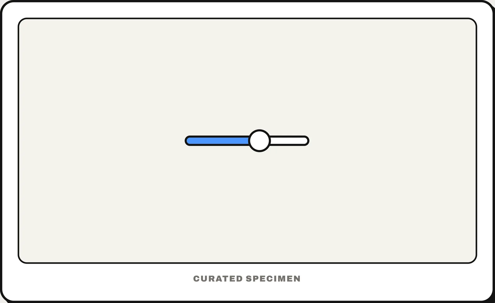
Also called: slider control, range slider.
You might call it
- “the volume bar you drag”
- “a range slider”
- “the dot you slide along a line”
- “a drag bar to set a value”
- “the brightness slider”
…its name is Slider.
Common questions
What is the bar you drag to change the volume called?
A slider (slider control): a track with a thumb you drag to pick a value from a range, such as volume or brightness. A range slider has two thumbs, for a minimum and a maximum.
Slider vs carousel: what is the difference?
A slider control sets a value by dragging along a track. A carousel, often called an image slider, shows one slide of content at a time that you swipe or click through.
In code
| SwiftUI | Slider |
|---|---|
| UIKit | UISlider |
| Jetpack Compose | Slider RangeSlider |
| Android (Views) | Slider RangeSlider |
| Flutter | Slider RangeSlider |
| Web (HTML) | <input type="range"> |
Prompt for your AI coding tool
Add a slider for this value: a horizontal track with a draggable thumb between a minimum and a maximum, the filled part of the track showing the current value, and the value itself shown next to it. Use steps if only certain values make sense. Arrow keys change it by one step, the thumb has a touch target of at least 44 px, and screen readers announce the current value (an <input type="range"> on the web).
More UI words to use when vibe coding →