Button types
/BUT-n TYPES/ · noun · ACTION pattern · #138
A button is the control you press to make something happen — Send, Save, Buy — where a link takes you somewhere else. Screens rank their buttons by how much each one stands out: a filled primary button for the main action (usually one per screen), an outlined or tinted secondary button for the alternative, and borderless text (tertiary) buttons for minor actions like Cancel. An icon button shows only a symbol, such as a heart or a bin.
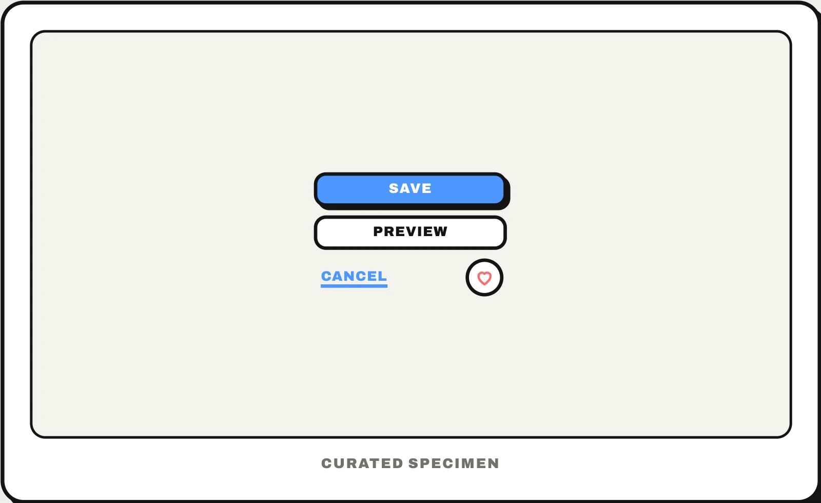
Also called: primary button, secondary button, text button, icon button, CTA button, call to action button.
You might call it
- “the main button on the screen”
- “the plainer button beside the main one”
- “the primary and secondary buttons”
- “the button with just an icon”
- “the button that looks like a link”
- “the big coloured button to buy or sign up”
…its name is Button types.
Common questions
What are the types of buttons in UI design?
By emphasis: a filled primary button for the main action, an outlined or tinted secondary button for the alternative, and a borderless text or tertiary button for minor ones. By form: an icon button shows only a symbol, a floating action button hovers over the page, a split button adds a menu arrow, a toggle button stays pressed. Material’s five are elevated, filled, tonal, outlined and text.
Primary button vs secondary button: what is the difference?
The primary button is the action you most expect people to take, so it gets the strongest look, usually a solid fill in the brand colour. The secondary button is a real alternative, such as Back or Save draft, styled more quietly with an outline or a pale fill so the two never compete. Keep one primary button per screen or dialog: if everything is primary, nothing is.
Button vs link: when should you use each?
Use a button when it does something on the page — submits a form, opens a dialog, plays a video — and a link when it goes somewhere: another page, or a place in this one, with a URL you can copy or open in a new tab. Screen readers announce them differently and keyboards treat them differently (Space presses a button, not a link), so pick the element by what it does, then style it as you like.
In code
| Web (HTML) | <button> <button type="submit"> Use <a href> instead when it takes people to another page |
|---|---|
| SwiftUI | Button .buttonStyle(.borderedProminent) .bordered .borderless |
| UIKit | UIButton UIButton.Configuration.filled() .tinted() .plain() |
| Jetpack Compose | Button FilledTonalButton OutlinedButton TextButton IconButton |
| Flutter | FilledButton OutlinedButton TextButton IconButton |
| React (MUI) | <Button variant="contained"> variant="outlined" variant="text" IconButton |
Prompt for your AI coding tool
Give this screen a clear button hierarchy: one filled primary button in the brand colour for the main action, an outlined or tinted secondary button beside it for the alternative, and text buttons for minor actions such as Cancel. Use <button> for actions and <a href> for navigation, label each with a verb (Save, Send), make touch targets at least 44×44 pt on iOS and 48×48 dp on Android, give icon-only buttons an accessible name, and show hover, pressed, focus, disabled and loading states.
More UI words to use when vibe coding →